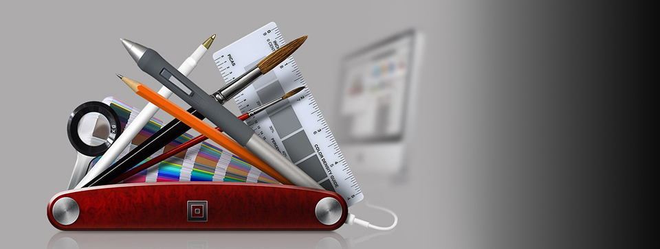

Back in medieval times (this was around 2009), designing a website was pretty simple. My, times have changed. Designing a website today is really dependent on the type of site you want to build. Websites typically fall under three different categories: E-Commerce, Informational and Portfolio. This blog is intended to guide you through some basic design principles on what to look out for when designing a website. Keep in mind, this is just the aesthetic portion of a website; the pretty stuff. The front end design that makes a web visitor say, “Ooh! What’s this site about?” Or, better yet, “Wow! what a great website. I didn’t get lost or end up on a completely different website. I didn’t even lose my thought process!” You know how it is–you get to a website with the intention of finding out some information or buying a product, and end up on YouTube learning how to talk to giraffes. Cyber-Construction’s websites don’t allow you to succumb to meandering aimlessly through the endless black hole we call the internet. Allow us to explain the finer points of design principles for websites:
The Art of the Layout
 Depending on the type of website you are building, your website will have a layout which needs to work with whatever it is you are selling. Good e-commerce websites will have a layout that shows enough white space and is free of extraneous ads to allow showcasing their own products rather than someone else’s. This will also deter a web visitor from leaving your website. Let’s explore the website, icebreaker.com. It’s a pretty simple and clean website with clear navigation. There are no ads or tons of links. This is where the beauty of the layout falls into place. This site doesn’t give you hundreds of choices; it gives you four: Men, Women, Kids’, Collections. If you hover over those options, you will see all the additional options to choose from. They put all the important stuff at the top of the page, and placed all the less important stuff toward the bottom of the page. This is what we call, “Above the fold.” Think of it like a newspaper–big headlines go at the top. Thus, things you want the web visitor to know right off the bat should also be placed toward the top of the page. Why would you make someone scroll down your page to find your most important items or information? Less is more. Remember that because I’ll be repeating that phrase throughout this blog.
The other e-commerce site we like is bloomingdirect.com. A simple background is always attractive. They show their most popular choices at the top of the page. Drop downs are hidden so it doesn’t confuse the web visitor. You’ll notice that some websites have layouts in buckets of three’s or fours. This is a popular choice to use because again; less is more in web design. The three buckets layout is extremely popular and safe because during some psychological testing done by some Ivy league school (yeah, I’m making this up, but I know for a FACT there has been a lot of testing as far as layouts, colors, and font choices are concerned), the number three is simple. It’s not a couple; it’s a few. It provides a varied choice to someone who is looking at your website.
Look at the site called indetail.co.za and you’ll know what I’m talking about. There are three big graphic images right on the home page: Detail Revamp, Detail Interior, and Detail Decorate. There’s a brief segue-way describing each bucket with a call to action (CTA) to learn more about it. See how simple that is? Do you know what I’m going to say? That’s right–less is more. The last example of the three bucket rule is markshale.com. You’ll notice how the site is laid out specifically to have the web visitor viewing their blog, a personal shopper service, or the featured item. This site is different from the previous three bucket site because it’s strictly imagery; no segue-way or CTA. It’s uber-clean, although I don’t particularly care for the background (but, who am I to judge?) What if your website isn’t e-commerce? Good question.
If you want to provide a portfolio website, the one I really love is nickbrandt.com. This is a photography portfolio website. When you are an artist and want to showcase your work online, the most important rule of thumb is (drum roll, please…) less is more. This site nails it with a neutral gray (we’ll go into colors in a bit), with a non-intrusive navigation. The purpose of this site succeeded because the only thing you are focused on is the photography–nothing else. Layouts on portfolio sites, if showcasing art, photography or your crocheted bracelet collection, should allow for images to be enlarged or big enough to be inserted into a slider gallery with an option to stop the slider so people can look at your work a bit closer.
Personal websites like okaydave.com are completely dependent on the person and how you want to portray your personality to others. As you can see, Dave’s website is funky, fun and a bit whimsical. He’s a cartoonist, media artist plus a whole lot more. To me, it’s a fun, creative website showcasing his work as well as his personal style.
Colors and What They Mean

You would think that color wouldn’t make that much of a difference, but it really, really does. In several reports based on psychological testing (yes–again, I have no idea who these people are, but they know their stuff, trust me), their is a definite science to colors and what they mean to the human eye. Web design needs to do several things at once. It must make sure the navigation of the website is clear. It must hold an internet user’s attention for as long as possible. And it must gently lead the user down the conversion funnel, quietly urging the user to do whatever action the site owners have as the goal of the site. Because web design needs to have an influence over people’s behavior, more and more designers have been looking to the psychology of color to help them create websites. They can play on cultural references to suggest trust, urgency or mystery to the target audience. Let’s explore what some colors mean:
Red – This is a stimulating, exciting color. It is associated with passion, power and sometimes anger. It can be used for warnings or to show danger, but it can also suggest strength, determination and boldness. Warmer reds, like brick or maroon, are strong and comforting–good for sites that want to suggest the lasting qualities of a brick wall. Brighter reds, like true red or tomato, are great for youthful websites that want to suggest energy and eagerness to leap before they look.
Pink – This shouldn’t be shocking to anyone, but pink is associated very strongly with youthful femininity. It is playful and brings to mind bubble gum and innocence (or not). Think Victoria Secret. It’s also ideal for websites who want a vintage look.
Orange – This is a more balanced and less overwhelming color than red. Vibrant, energetic, friendly and inviting, it is ideal for designs that need movement and energy. Websites that want to showcase their creativity often choose orange because it is unique and exciting, but it still has the comfort of a warm color.
Yellow – This is often considered the most energizing color. From the earliest ages, people learn to associate yellow with the sun, so it becomes associated with warmth and happiness. That makes bright yellow perfect for sites designed for children, as it grabs their attention. More subtle shades of yellow have more complex associations. Darker shades can suggest antiquity, suggesting yellowed parchment. Because of that, it can also be associated with wisdom and curiosity. Yellow is great for sites that want to demonstrate a sense of authority and intelligence.
Green – To me, this is kind of a no-brainer. Green is strongly associated with plant leaves and subsequently has lots of positive associations. It can give users feelings of calm, rejuvenation, affluence and optimism. Darker shades are more linked to money, so sites that want to suggest affluence, growth and stability often use those shades. Lighter shades are more associated with spring and growth, so websites that want to reflect relaxation, freshness and honesty often use lighter shades. Green is also directly associated with the environmental movement, so sites that aim to broadcast ethical standards often use green.
Blue – I’m sure you’ve been on plenty of business websites. Most will have blue on them because this color calls to mind dependability, trustworthiness and security. It is also calming and has an element of spirituality about it. The use dark blues to call to mind their experience, success and reliability. Light blues are best for friendly, open websites; think Twitter.
Black, White or Gray – Black, white and grey are usually background colors, allowing brighter colors to make the real impact. Still, they call to mind their own associations. Black suggests power, modernity and sophistication, while white suggests cleanliness, simplicity and innocence. These competing associations play off of each other as nicely as the colors themselves do, making black and white designs especially strong. Grey is a neutral color. When used well, it is associated with tradition, somberness and calmness. When used badly, however, it can cause a design to lack energy. Most portfolios use grey because it’s a neutral color and not distracting. Okay – enough about color. I can go on all day about browns, turquoise and aubergine, but I have to inform you about Calls To Action, or as we’d like to call them, CTA’s.
What’s That Big Button Do?
Yes. Press the button. That’s what a CTA wants you to do. Calls To Action are very important on a website. It simplifies the conversion process. “Call Now.” “Schedule An Appointment.” “Place Your Order.”
“ACT TODAY!!!!” You get the point. CTA’s should always be placed at the top of the page–or as I stated earlier–above the fold. They will do nothing effective if they are placed at the bottom of the page because the sole purpose of CTA’s is to get the web visitor to act. Act now before it’s too late or the whole internet blows up. They can always be placed on the left or right side, but typically, and again psychological testing suggests that people like to see those big, colorful buttons on the right side of a web page since most people read left to right and also happen to be right handed.
I Don’t Like Your Tail
 I’m not getting personal. I’m talking about font choices. Do you like fonts that have an end to each letter, or do you like fonts that have blunt endings? This is the difference between a sans font and a sans-serif font. A “serif”, so to speak, is the tail on the end of a font. The best way to choose fonts is to provide contrast to compliment one another. Most websites have more than one font choice. Some can be disastrous combinations, while others can be quite beautiful. Some awesome combinations to consider are Georgia and Verdana, Bodoni and Futura, Minion (bold) and Myriad, as well as Clarendon and Trade Gothic. The first name of these combinations are all serif fonts. The second names in these combinations are all san-serif fonts. It’s like peanut butter and jelly, Laurel and Hardy, or Butch Cassidy and the Sundance Kid. They are complete opposites, yet highly attractive together. The last thing to consider with font choices is, oh, what is it? Less is more. Please don’t get all swirly and cursive on me when you want to make a very important point. The more ornate your font choice becomes, the more difficult it is to read–especially on a computer screen. Keep your font choices legible and only use two or three fonts at the most for your website design.
As you can see, there is a lot to consider when designing a website. Planning is key, so put it all on paper first and then take it to the computer keyboard. Of course, Cyber-Construction can always help you with your website design because we’re experts at it. We can remove your stress of choosing between blue or gray, Verdana or Futura. It’s our job, and we’re that good.
* Please note provided website examples are third party examples of websites. We in no way directly endorse their product, service, or message by their inclusion in this post.